
I was looking for a bit of a boldness and thought the burgundy was a good idea but I think I prefer the blue as well. I think I might embelish this quilt with beads or something so that could be my boldness or sparkle. Plus there is the sparkle of the gold ribbon.
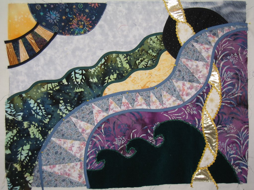
Any opinions out there? I have just a couple more bias strips to sew on and then I can layer it. I am starting to like it. The big wave at the bottom is green velvet - hard to see in the photo and I put a decorative stitch around the edge instead of bias strips, which would have been very difficult to put on with the tight waves.

Wow, that is really really neat. You've got to be glad you've gotten it out again, it is really so creative! I think I like it with the burgundy stripe the best, but either way it is lovely.
ReplyDeleteVery pretty! I like it with the blue. The gold ribbon definitely gives it sparkles, too.
ReplyDeleteI enjoyed seeing your Lorraine Torrence wall hanging. I posted a picture of mine a while back. http://fruitjarnicky.blogspot.com/2006/11/happy-be-lated-halloween.html
ReplyDeleteI need to go back and give Lorraine credit. I had forgotten her name. It has been a few years since she did a workshop for my quilt guild. Thanks for sharing!